
Screen Resolution Simulator
Instantly test your website's responsiveness across multiple screen sizes and devices.


Screen Resolution Simulator: Perfect Your Website's Look Across All Devices
In today's world of smartphones, tablets, laptops, and ever-changing screen sizes, website responsiveness is non-negotiable. Our Screen Resolution Simulator empowers you to instantly visualize how your website renders on different devices, enabling you to fine-tune the user experience (UX) and boost your search engine rankings.
Why Does Screen Resolution Matter?
- User Experience (UX): A website that fails to adapt across screens can lead to distorted images, awkward navigation, and unreadable text – frustrating users and causing them to bounce off your site.
- Search Engine Optimization (SEO): Google and other search engines favor websites that offer seamless experiences on all devices. Poor mobile responsiveness can hurt your rankings.
- Conversion Rates: A well-designed, responsive website translates into better engagement, higher conversions, and increased ROI.
How Our Screen Resolution Simulator Helps:
- Precision Testing: Choose from a wide range of popular resolutions or input custom dimensions for unparalleled control.
- Instant Insights: See exactly how your layout, images, and content adjust across different screens in real-time.
- Identify problem areas: Pinpoint where elements break down, text becomes unreadable, or navigation gets clunky.
- Streamline Optimization: Make informed adjustments to your CSS and design to ensure a flawless experience for all visitors.
Who Benefits from Our Tool:
- Web Developers: Ensure your code delivers optimal rendering on all devices.
- Web Designers: Create responsive designs that shine across screen sizes.
- Digital Marketers: Test landing pages and campaigns for flawless display.
- Website Owners: Protect your brand reputation and user experience
The Tool4SEO Difference
- Completely Free: Enhance your website without breaking the bank.
- User-Friendly Interface: No technical expertise is required.
- Fast and Reliable: Get instant results without the hassle.
Get Started Now:
- Enter your website URL
- Select your desired screen resolutions
- Optimize your website for flawless viewing.

IMOH JAPHET
CEO / Editor
Imoh Japhet is a multi-talented Tech-Pro with passion for web development, Mentoring, Customer Satisfaction, and Content Creation. His decade of experience led to Tool4SEO.com; a free online Toolkit built to help you simplify web development, daily tasks and content creation.
Popular Tools
Recent Posts

AI Tools for Web Scraping
September 15, 2024

Best AI Tools for Web Development
September 15, 2024


SEO Tools for Small Businesses
May 18, 2024
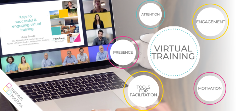
Online Training Tools For Trainers
May 7, 2024

Free Online Assessment Tools for Teachers
May 6, 2024


The Ultimate Guide to DA & PA Checker
May 5, 2024
Disclaimer Generator for YouTube: Protect Your Channel and Limit Liability
September 15, 2024

YouTube SEO Tool
May 5, 2024